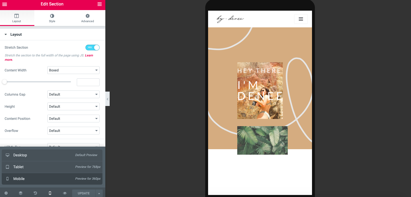
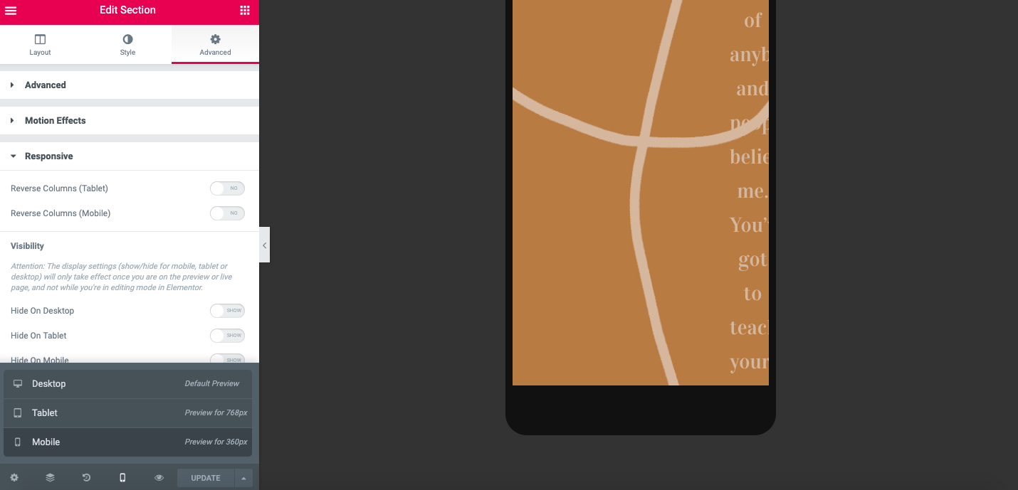
In Elementor you can view what your website could look like from a desktop, tablet and mobile point of view. A lot of my designs clashed.
So for my front cover I had to hide the Welcome page and create a new one that worked for my mobile and tablet view of things. Also hiding those from my website. I have made new mobile and tablet responsive modes.
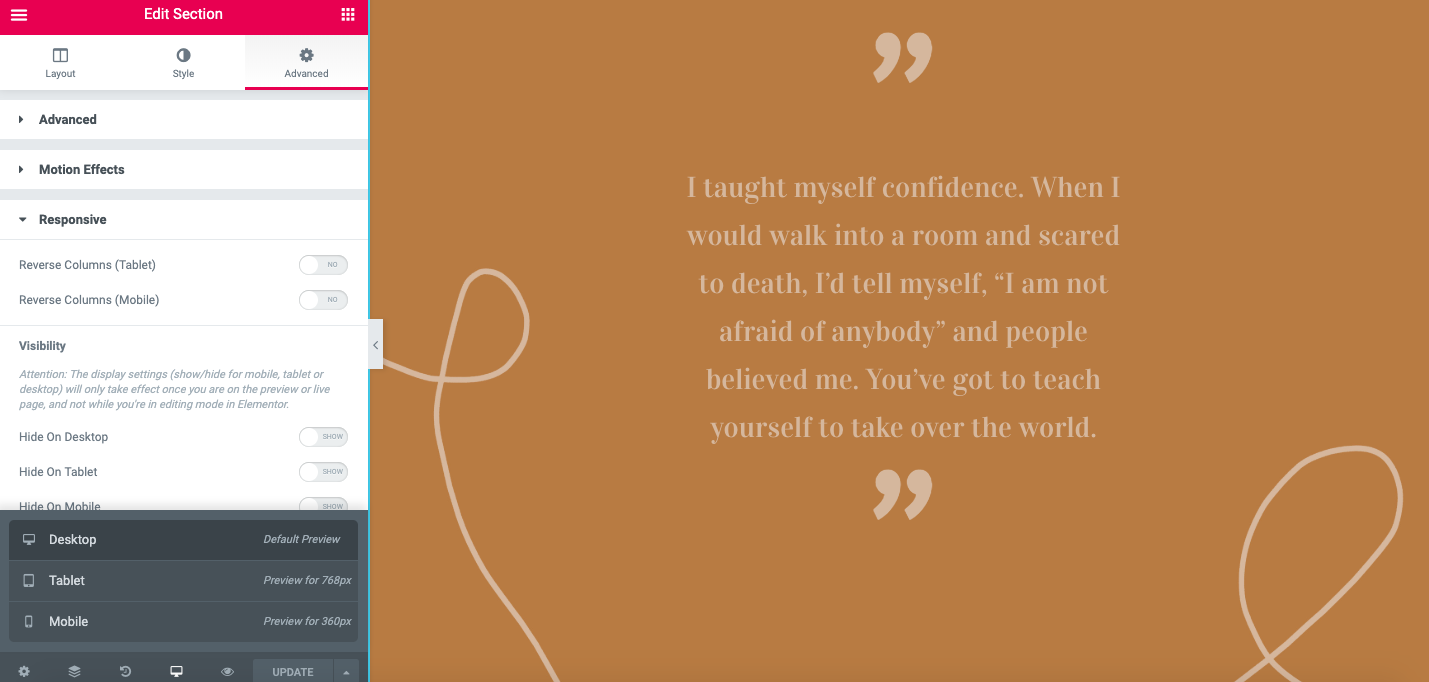
I also had to change my quote section because it was not working for my mobile and tablet version too! This is the before…
You can really see it on the mobile version. It’s completely out of focus and the tablet is far to squished. And this is after… You can see it is way better, you can actually see what the text is saying.
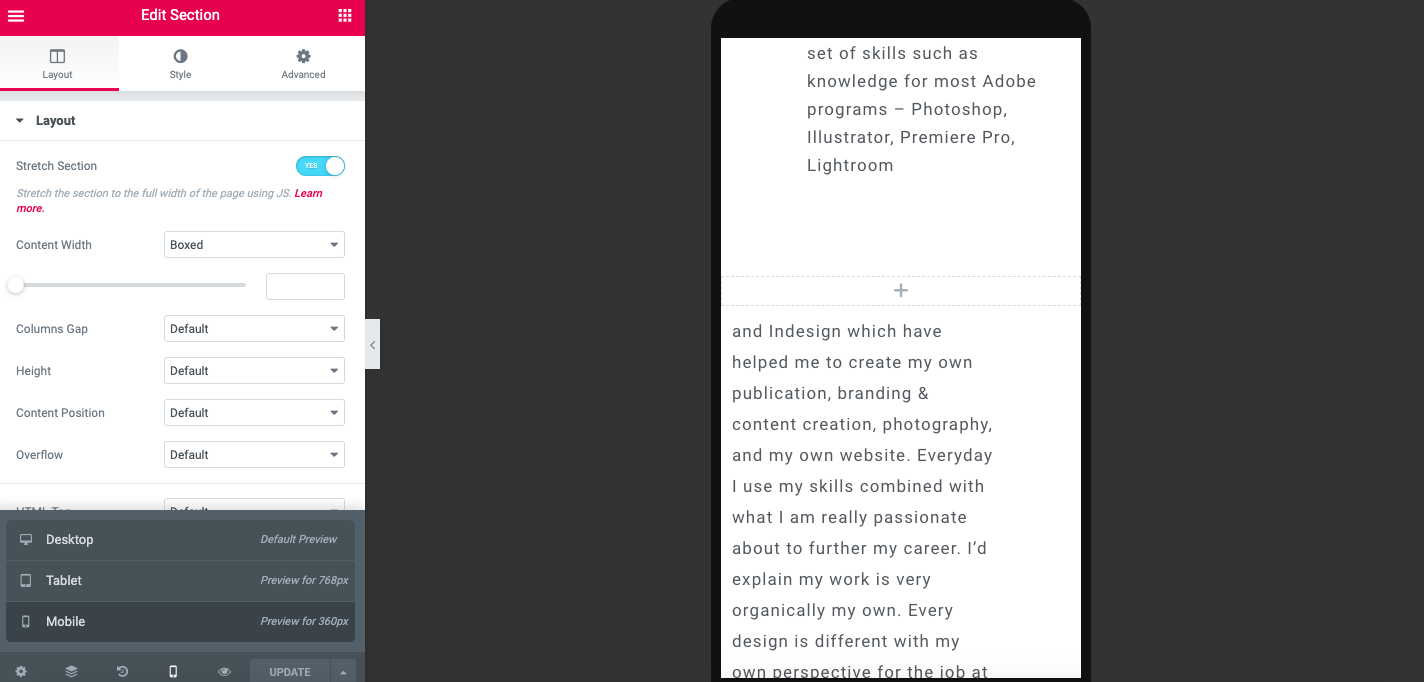
One of my articles also did not work so I changed that to make it more user friendly for the tablet. It was not picking up the photograph, so I moved it around, but also found a better photograph to use, one that was more awesome.
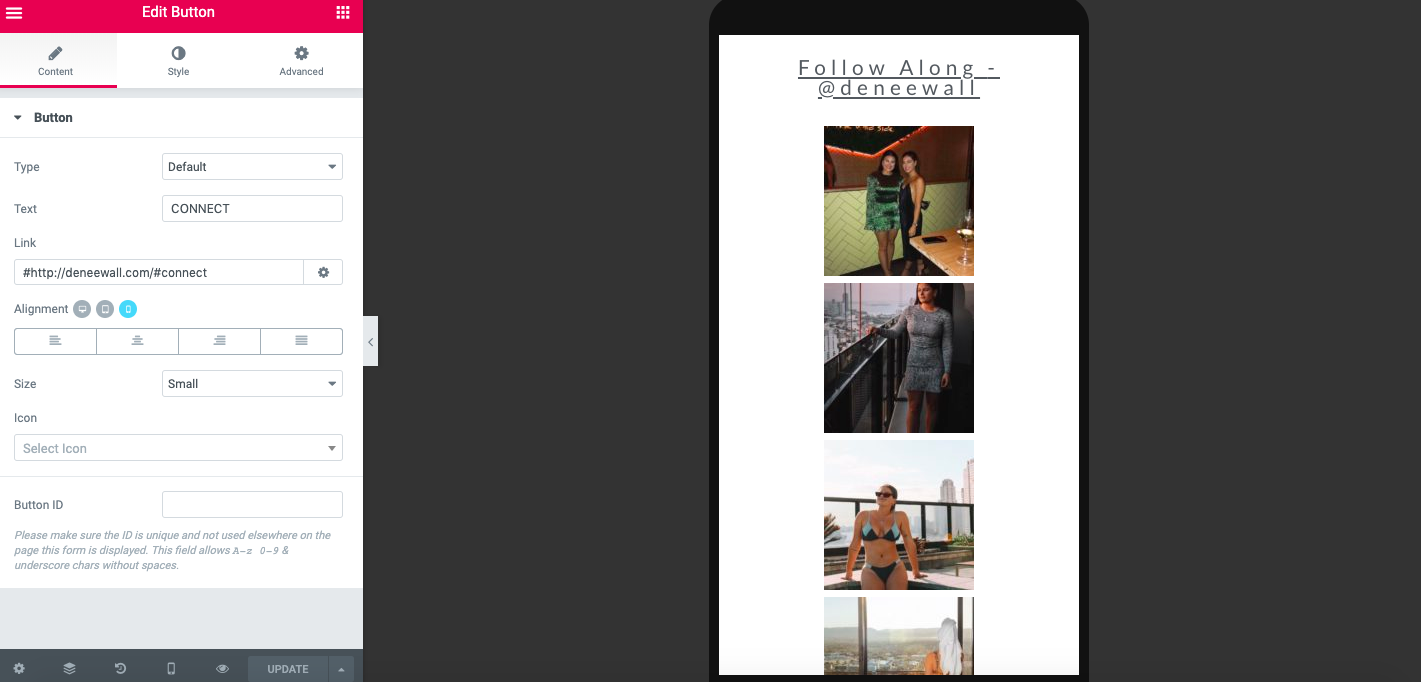
I also changer my photo grids and made image carousels for them. Worked way better for the mobile version.


 Denee's Research